Palladio is a free browser based network analysis and visualization tool. It is a good tool for beginners as it is more user friendly and easier to learn than the more powerful software Gephi (which is one of the most well known network softwares). Palladio is also good for Digital Humanitarians to use, because it supports both unimodal and bimodal networks. This means that one can compare data of one type to data of the same type (unimodal) or data of one type to data of a different type. This is helpful in the humanities because our data sets normally have lots of different types of data (places, people, datas) instead of just one kind. Palladio can be found at: http://palladio.designhumanities.org/#/.
In order to work with network analysis, it is helpful to understand two basic terms. When building a network each data point is referred to as a node. Each of the lines or links connecting two data points is called an edge. In order to successfully utilize networks and visualization, it is helpful to use data that is relational in nature. For example, book 1 (data 1) is authored by (relationship) author 1 (data 2). For my example network analysis, I have used the data from the Alabama WPA Slave Narratives provided by Project Guttenberg. In that data, there are many relationship that can be explored, like former slave 1 (data 1) was interviewed in (relationship) location 1 (data 2).
To get started, you have to upload data stored in CVS files (spreadsheets). My first spreadsheet had columns with 9 categories across the top: Interview Subject (name), Male/Female, Age, Where Interviewed, State Where Interviewed, When Interviewed, Interviewer, Type of Slave, and Topics of Conversation. I also uploaded a CSV file including all the place names mentioned in the interviews and their geographic coordinates. Finally, I included a third CSV file with more information about the formerly- enslaved including where they were enslaved and where they were interviewed.
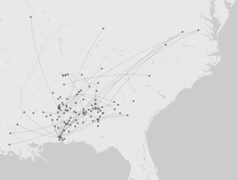
Palladio lets you view network “maps” and network “graphs.” The map feature lets you see you data points plotted on a geographic map, but it also shows the edges which connect one data point to another. After choosing, the “New Layer” button, I selected a “Point to point” map, with the Source Places set as “Where Enslaved” and the Target Places set as “Where interviewed.” I ended up with a map that showed the connection between the the geographic location where each person was enslaved and the geographic location where the interview was held. As you can see from the map, this visualization was helpful in showing the wide geographic range of places where the formerly-enslaved had lived and the long journeys they must have made during their lifetime. It also shows clusters of places were former slaved ended up (by the time of their interview). The downside to Palladio’s map, is that one cannot tell which nodes are the sources (places enslaved) and which are the targets (places interviewed).
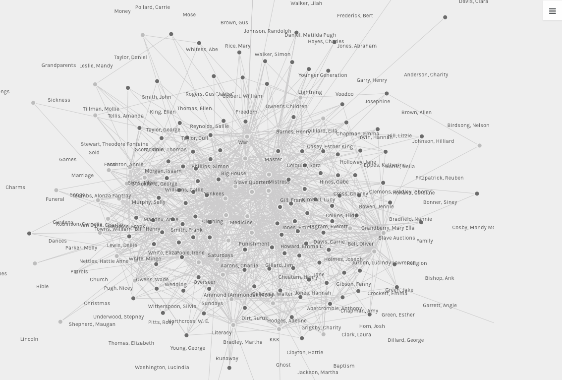
Palladio’s other tool is its network graphing. By choosing various combination of categories for the source and the target, I came up with several different network graphs. Some of the graphs (as can be seen below) were utterly unhelpful and looked more like a giant bowl of spaghetti than an useful analysis tool.
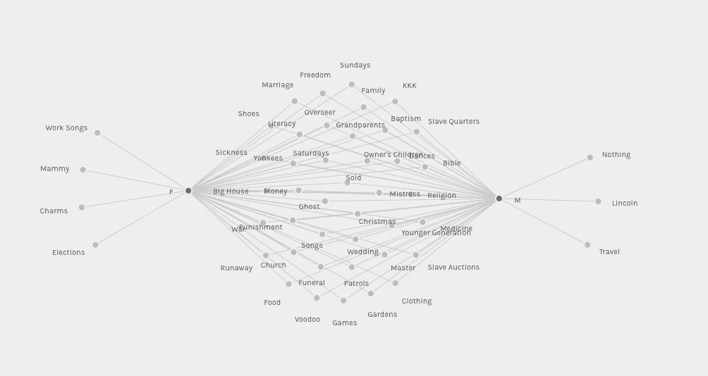
But on a few occasions, I stumbled across something that was particularly insightful. For example, I picked “M/F” as my source and “Topics” as my target. Instead of a pasta graph, I was greeted by graph with about 40 topics in the middle (Sunday, Literacy, Food, Bible, Ghosts, Voodoo, Weddings, Sold, Gardens, Punishment, Money, Patrols, Runaway, Dances, Big House, etc), one node on either side (for Male and Female) and then just a few nodes towards the outside. This signified that there were lots of topics that the former slaved talked about in their interviews that were common to both male and female interviewees. Those are the topics depicted in the middle. But on the outside were topics only male or only female interviewee talked about: only females talked about work songs, mammy, charms and (surprisingly!) elections; only men discussed travel, Lincoln and “Nothing.”
Just like other digital tools, network analysis and visualization cannot explain the results they output. That is for us, as scholars to interpreted. But they are especially good at pointing out patterns or trends in a large data set that is more easily recognized visually by the human eye than it could be by searching through long lists or databases.
These tools allow one to ask sorts of questions. From my gender/topic graph, I might ask, why did only women (and not men) in the interviews talk about elections (a political subject)? Why did men talk about Lincoln, but not elections? What about the male only subject of travel? Historians have discovered many more instances of male slaves leaving plantations to deliver goods for a master, hire out his own time or go visit his wife or family on a nearby plantation. The majority of slave women seldom left the plantation where they worked. Could males have felt more comfortable than females with the idea of going out into an unknown space, hence their comfort in traveling and discussing travel? The possibilities for questions are endless!